 |
| Painting by Vicky Christensen, acrylic on 12 X 16 Blick hardboard panel |
Showing posts with label Wet Canvas. Show all posts
Showing posts with label Wet Canvas. Show all posts
Friday, April 10, 2015
Blazing Skies

Sunday, October 5, 2014
Work in Progress: Rocky Pond
 |
| Acrylic painting, work in progress |
Below is the pastel painting. The original inspiration is a photo I found in the Wet Canvas reference image library (http://www.wetcanvas.com/RefLib/showphoto.php?photo=88393).
 |
| Same subject, different medium (pastel) |
Thursday, September 18, 2014
Waterfall
 |
| Painting by Vicky Christensen, acrylic on canvas, 22 X 28 inches |
Thursday, September 11, 2014
Sunset on San Salvador, Bahamas
 |
| Painting by Vicky Christensen, acrylic on 18 X 18 inch canvas |
Thursday, September 4, 2014
Moon Rise Over LI Sound
 |
| Painting by Vicky Christensen, Acrylic on canvas, 12 X 16 inches |
Monday, September 1, 2014
Morning Sun Over the Lake
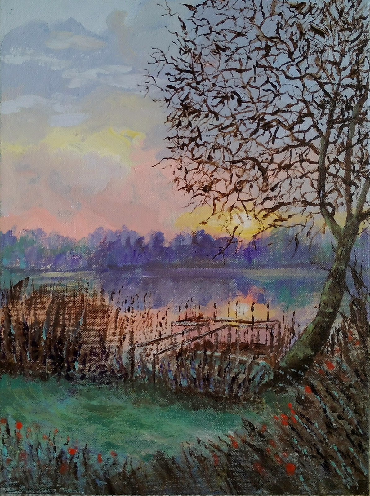 |
| Painting by Vicky Christensen, acrylic on canvas, 16 X 12 inches |
In some ways I think this looks more like a watercolor than acrylic on canvas. I kind of like the effect.
Wednesday, August 27, 2014
Experiment: Acrylic on Ampersand Pastelbord
 |
| Painting by Vicky Christensen, Acrylic on Ampersand Pastelbord, 12 X 16 inches |
The inspiration for the painting was a photo I found in the Wet Canvas reference image library: http://www.wetcanvas.com/RefLib/showphoto.php?photo=67973. I had planned on painting it with pastels but it was fun to do it with acrylic paints.
Monday, August 18, 2014
Another Attempt at Painting Water Lilies
 |
| Acrylic on canvas, 24 X 30 in. |
Monday, August 11, 2014
Daisy and Friend
 |
| Acrylic on canvas, 12 X 16 in. |
Saturday, August 9, 2014
Hibiscus, Up Close and Personal
 |
| Acrylic on stretched canvas, 18 X 18 in. |
Friday, August 1, 2014
Sailboat Anchored at Sunset

Today's painting is based again on a photo from the Wet Canvas reference image library. There is something about skies and water that compels me to paint them.
Since painting with acrylics is new to me, I have been doing a lot of reading and searching the internet, including You Tube, for tips and pointers. I have been getting a lot of info from the Will Kemp Art School web site. He advocates painting over a colored ground rather than the white of the primed canvas. For this painting I started by painting the canvas with a mixture of titanium white and alizarin crimson. I don't know if it helped, but it sure was a pretty color.
Wednesday, July 30, 2014
Wave Without Seagulls
 |
| acrylic on 18 X 24 in. canvas |
Monday, July 28, 2014
Fall Reflections
 |
| acrylic on 18 in by 24 in canvas |
Saturday, July 26, 2014
More Fall Colors
 |
| acrylic on 12 in by 16 in canvas |
Friday, July 25, 2014
And Now for Something Completely Different
 |
| acrylic on 12 in by 16 in canvas |
I did the painting over a couple days. The first day was spent working on the clouds/sky. Here is what it looked like after day 1:

I thought the skies needed a little more punch so I decided to try a glaze with alizarin crimson. Since I have never done a glaze before I searched online for instructions. I got a little too heavy handed in spots, but I think the glaze helped convey the stormy atmosphere.
Wednesday, July 16, 2014
Underpainting
After I finished the community ed pastel painting class I realized that I needed a lot more than just a few night classes. So I looked for books and online sources of instruction. Just about every resource I found put an emphasis on doing underpaintings. I watched some previews of Artists Network presentations by Liz Haywood Sullivan on You Tube and was fascinated by how she made underpaintings with pastel and alcohol. Later I found some great You Tube videos of Leesa Padget painting, set to great background music (highly recommended!). I thought "I need to try this!" So I did, and I have been hooked ever since.
Pastel and Alcohol Underpainting on Pastelbord
This is one of the first paintings I did with a pastel and alcohol underpainting. This is also the first painting I did on Ampersand Pastelbord, and I must say I love this surface. It is great for any wet media underpaintings, plus I love how it grabs the pastels.
Watercolor Underpainting on Pastelbord
Pastel and alcohol underpaintings are great, but I really wanted to try watercolor. I found a photo taken at Monet's Giverney in the Wet Canvas reference image library that I really wanted to paint, so I took a stab at it. The result is above. I found that I really love using watercolor for underpainting. I am not a watercolor painter, so I just block in the major areas of the painting with watercolor, not worrying about fine details.So far I haven't strayed too far from the "local" colors when painting the underpaintings. If I'm lucky I can keep some of the watercolor uncovered by pastel in the finished product. Even if I do cover it with pastel, just working out the composition with the watercolor makes the painting process a lot easier.
Watercolor Underpainting on Wallis
This is another watercolor painting, this time on Wallis Museum. This surface was a little more resistant to the watercolor but still handled it well.
Pastel and Alcohol Underpainting on Pastelbord
 |
| Pohoiki Bay, near Hilo Hawaii; pastel on Ampersand Pastelbord over pastel/alcohol underpainting |
Watercolor Underpainting on Pastelbord
 |
| watercolor underpainting on Ampersand Pastelbord |
 |
| Finished painting |
Pastel and alcohol underpaintings are great, but I really wanted to try watercolor. I found a photo taken at Monet's Giverney in the Wet Canvas reference image library that I really wanted to paint, so I took a stab at it. The result is above. I found that I really love using watercolor for underpainting. I am not a watercolor painter, so I just block in the major areas of the painting with watercolor, not worrying about fine details.So far I haven't strayed too far from the "local" colors when painting the underpaintings. If I'm lucky I can keep some of the watercolor uncovered by pastel in the finished product. Even if I do cover it with pastel, just working out the composition with the watercolor makes the painting process a lot easier.
Watercolor Underpainting on Wallis
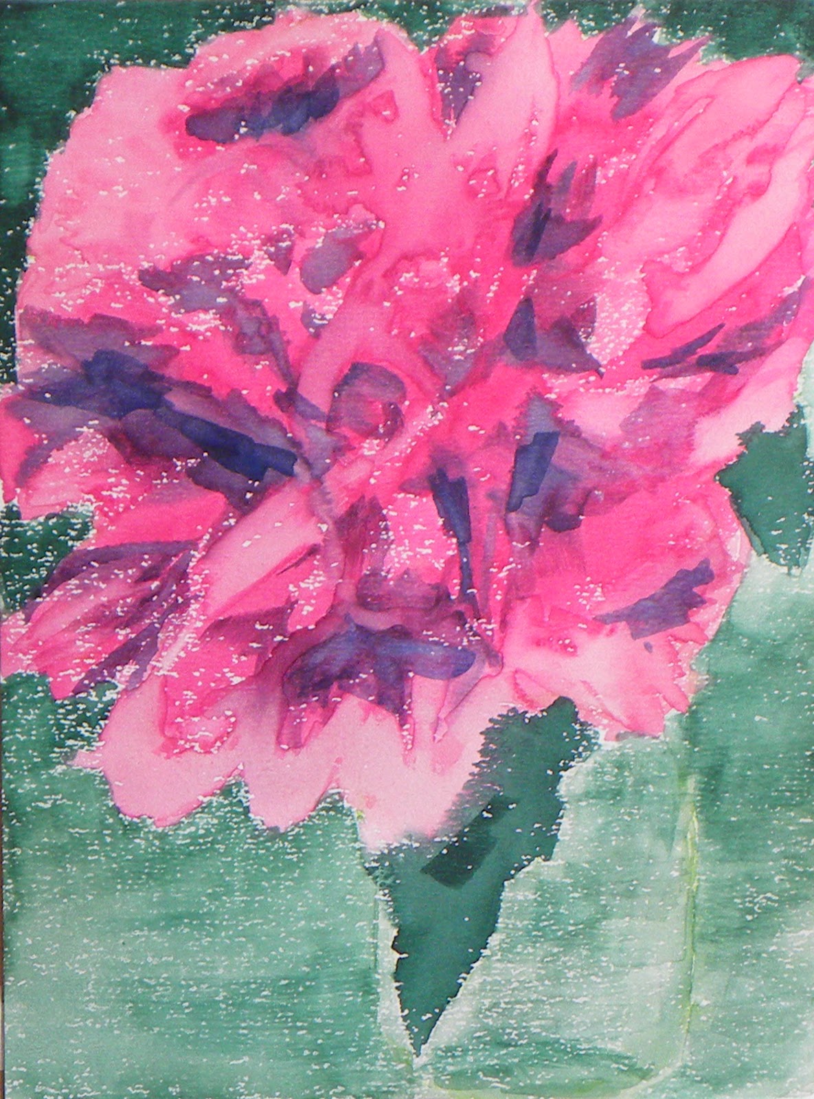 |
| watercolor underpainting on Wallis Museum sanded paper |
 |
| finished painting |
Watercolor Underpainting on Art Spectrum Supertooth
The watercolor flowed quite nicely on the Supertooth. I was able to control the water plus reflections and the shading on the rocks in the foreground quite nicely.
 |
| watercolor underpainting on Art Spectrum Supertooth |
 |
| finished painting |
Sunday, July 13, 2014
Artist's Block, Part 2
I am finding that once you spend your hard-earned money on art supplies, you find yourself not wanting to waste them. Unfortunately that leads to another level of artist's block. A good set of pastels can run into hundreds of dollars. Sanded papers and other textured surfaces can be quite expensive. So you find yourself questioning whether a subject is worth the expense of the supplies used to paint it. This is a dilemma if you really like to paint and you want to get better at it. Getting better requires practice, lots of it.
While searching for information about matting and framing pastel paintings (another expense no one tells you about ahead of time) I chanced upon http://www.wetcanvas.com/. Wet Canvas is a great online resource for artists of all skill levels. I won't endeavor to list everything you can find at Wet Canvas. Suffice it to say I got my answers about how to mat and frame and much more. One of the greatest resources is the Wet Canvas reference image library. Members have uploaded a multitude of reference images that can be used as artistic inspiration without paying licensing fees. I wasted no time downloading a number of photos I wanted to paint.
This is the first one that grabbed my eye:

The unanswered question was: can I paint it? I decided to do a couple of trial runs of one apple on Canson Mi Teintes before committing to a full painting. These two pictures were my first attempts with my new set of Blick pastels. I did two trials: one on the textured side of the paper and one on the smooth side.
My first thoughts were:
While searching for information about matting and framing pastel paintings (another expense no one tells you about ahead of time) I chanced upon http://www.wetcanvas.com/. Wet Canvas is a great online resource for artists of all skill levels. I won't endeavor to list everything you can find at Wet Canvas. Suffice it to say I got my answers about how to mat and frame and much more. One of the greatest resources is the Wet Canvas reference image library. Members have uploaded a multitude of reference images that can be used as artistic inspiration without paying licensing fees. I wasted no time downloading a number of photos I wanted to paint.
This is the first one that grabbed my eye:
The unanswered question was: can I paint it? I decided to do a couple of trial runs of one apple on Canson Mi Teintes before committing to a full painting. These two pictures were my first attempts with my new set of Blick pastels. I did two trials: one on the textured side of the paper and one on the smooth side.
 |
| Blick pastel on textured side of Canson Mi Teintes |
 |
| Blick pastel on smooth side of Canson Mi Teintes |
- I like these pastels!
- I can paint apples!
I was ready to give the full painting a try. But a trip to Hawaii got in my way. I know, what a hardship.
Subscribe to:
Posts (Atom)