Wednesday, August 27, 2014

Experiment: Acrylic on Ampersand Pastelbord

Painting by Vicky Christensen, Acrylic on Ampersand Pastelbord, 12 X 16 inches
I wasn't planning on painting today. But I had some paint left over from yesterday and on the spur of the moment I decided to do something fast and loose. I also wanted to try acrylic on Ampersand Pastelbord. I have used Pastelbord a number of times for pastel paintings but I have never used it for acrylics until tonight.

The inspiration for the painting was a photo I found in the Wet Canvas reference image library: http://www.wetcanvas.com/RefLib/showphoto.php?photo=67973. I had planned on painting it with pastels but it was fun to do it with acrylic paints.

Tuesday, August 26, 2014

Land of 10,000 Lakes

Painting by Vicky Christensen, acrylic on canvas, 16 X 12 in.
I've been painting a lot of scenes from Hawaii, mostly because I have my vacation photos (and some from my nephew) to draw from for inspiration. I got to thinking about the beautiful places in my own state of Minnesota. Today's painting was inspired by a photo I took during a weekend on the North Shore of Lake Superior. The photo was taken probably 25 years ago, so I don't recall where the photo was taken. But I'm pretty sure it is of Lake Superior and not some nearby lake, simply because you can't see the opposite shore.

There are some beautiful places in Minnesota, but few compete with the beauty of the North Shore when the leaves are changing color.

I also found some photos of Gooseberry Falls, so look forward to a waterfall in the near future.

Monday, August 25, 2014

Up in the Trees

Painting by Vicky Christensen, acrylic on canvas, 18 X 24 inches
When I took the photo that was the inspiration for this painting, I told my nephew I wanted to paint it. He took one look and said "that's going to be hard." And he was right. My intent was to capture the essence of the canopy of colorful tropical palm trees without getting too bogged down in realistic detail. The logistics of layering background to foreground got complicated, especially with all the crossing trunks and branches. But I am glad I gave this a try.

Friday, August 22, 2014

Doing the Wave

Underpainting, acrylic on canvas, 18 X 24 in.

After I finished my last painting, I mixed the left-over paint and used it to paint an underpainting for my next painting. I ran out of the gray-green mix. so I finished the underpainting with ivory black and let it sit for a few days.

When the time came to select the subject for today's painting, my first thought was to do an abstract. But I chickened out. Next thought was to do something that took advantage of the black and gray underpainting. A shaded lane perhaps? I found a few possibilities along that line of thought, but finally settled on one of my nephew's photos: waves coming ashore on one of the Hawaiian Islands. This part of the coast is typical of the islands -- rugged black volcanic rock.


Painting by Vicky Christensen, Acrylic on canvas, 18 X 24 in.

Tuesday, August 19, 2014

Underwater Tranquility

Acrylic on canvas, 12 X 16 in. Vicky Christensen
The story behind today's painting: A couple years ago my nephew posted a video on Facebook that was unbelievably beautiful. When he was snorkeling he came upon a large mass of fish, swimming en masse as if they were part of a single organism. The video is beautiful in the way it captures the light filtering through the ocean water and reflecting off the fish. This is my attempt to capture the essence of that video in a painting. All credit goes to my nephew.

Update: more information about the fish depicted in this painting. They are part of a large school of fish called Akule. Here is a link with more information.


Monday, August 18, 2014

Another Attempt at Painting Water Lilies

Acrylic on canvas, 24 X 30 in.
Today's subject is Monet's water lily pond at Giverny. I used a photo from the Wet Canvas reference image library as a reference.

Thursday, August 14, 2014

Yet Another Waterfall

Pastel on Ampersand Pastelbord, 12 X 16 in.
Today's painting is another waterfall. This one is based on a photo taken by my nephew. I'm not sure if this is in Hawaii or in Alaska -- he spent the winter house-sitting in Hawaii and this summer is captaining a fishing boat in Alaska.

I started with a watercolor underpainting:


Some artists are so good at underpaintings that they can leave a lot of the underpainting showing in the finished painting. I am not able to do that yet. But I keep trying, and starting with the underpaining gives me a road map for the finished painting

Wednesday, August 13, 2014

Fall Is Just Around the Corner

Pastel on PastelMat, approx. 12 X 16 in.
Fall is approaching fast here in the northern hemisphere. I'm sad to see summer go, but pretty soon we'll be able to see the fall colors. A photo from the Wet Canvas reference image library caught my eye a few weeks ago and I new I would be painting it sooner or later. The photo was taken in New England, but fall colors can be just as beautiful here in Minnesota

Tuesday, August 12, 2014

Water Lilies Are Hard to Paint

Pastel on Ampersand Pastelbord, 16 X 12 in.
I decided to try to paint water lilies. I have a lovely photo that has been in my "to paint" pile for a while, one I took on vacation. Every other time I thought about painting it I passed, mostly because I thought it would be a tough one to get right. And boy, was I right about that. I learned that it is better to get your water + reflections painted right first, because it is almost impossible to fix it after you start adding the lily pads. And I never quite figured out how to paint the lily pads.

But I haven't given up on water lilies yet. I have a photo of Monet's Giverny lily pond that is waiting for me.


Monday, August 11, 2014

Daisy and Friend

Acrylic on canvas, 12 X 16 in.
I had some yellow left over from the last painting and I wanted to paint some daisies, so here is the result. I liked the way the Wet Canvas reference photo had the focus on the foreground daisy and everything else out of focus, so I tried to capture that effect.

Saturday, August 9, 2014

Hibiscus, Up Close and Personal

Acrylic on stretched canvas, 18 X 18 in.
I just now finished painting the hibiscus. The reference photo is from the Wet Canvas reference image library. I originally intended to paint this with pastels, but decided it would be fun to paint with acrylic paints. I'm glad I made that choice.

Friday, August 8, 2014

Sale at Blick, There Goes My Monthly Budget

Yesterday was the beginning of the "back to school" sale at the local Blick store. One of those deals where the more you buy, the more you save. In this case, 60% off on stretched canvases if you buy 10. So guess where I was yesterday afternoon. I ended up buying 10 canvases, some acrylic paints, varnish and a brush. All told I spent a little over 200 US dollars. Sometimes you have to spend big bucks to save big bucks.

Here is some irony: when I was looking for classes to take at the beginning of my retirement, I opted out of a quilting class because the list of supplies looked too expensive.

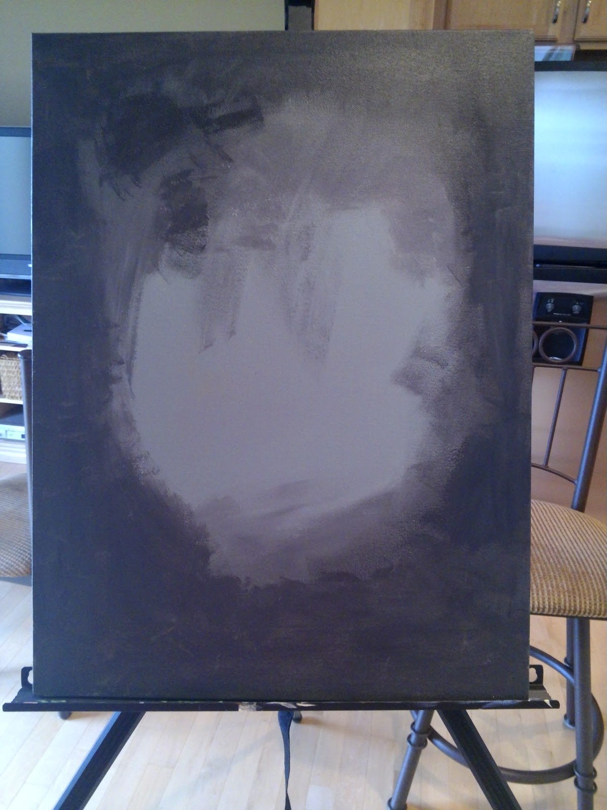
Today I am back to painting with acrylics. I had a lot of fun with the two recent pastel paintings but I don't want to let my recently-developed acrylic painting muscles atrophy. So my plan is to switch back and forth. I started to paint a hibiscus but haven't finished. It's in that awkward phase right now. I hope to finish it tomorrow. Here is a peek:

Notice my wonderful art studio (AKA kitchen) in the background. This is one of those moments when it is a good thing I am not married.

I also got around to framing the two waterfall paintings and I will be hanging them as soon as I find a good spot for them. For pastels of this size I like to frame them without mats. So I use spacers from FrameTek to keep a space between the pastel and the glass.
I'd like to hang them side by side. For now they are just propped up on my fireplace mantel.

Thursday, August 7, 2014

I Love Waterfalls

Pastel over watercolor underpainting on PastelMat, approx. 16 X 12 in.
Today's painting is another tropical waterfall. Who doesn't love them? My inspiration was a photo I took on my vacation in Hawaii.

As with Tuesday's painting, I painted a watercolor underpainting first, then finished with pastels. The surface is PastelMat, which grabs the pastels quite well, considering how velvety smooth it feels. I was able to put down quite a few layers of pastel, which is quite helpful when you are painting water. For Tuesday's painting I used Grafix Double Tack to adhere the PastelMat to acid free foam core, then did the underpainting. I noticed a slight amount of bowing due to the PastelMat swelling a bit from the water. So today I stapled the paper to an art board, painted the watercolor, then adhered it to the foam core after the watercolor dried. The staples left impressions in the paper, so I probably won't do that next time.

For what it's worth, here is the underpainting:

Tuesday, August 5, 2014

Tropical Paradise

Pastel on PastelMat, approx. 16 X 12 in.
My latest pastel painting -- a waterfall in the Hawaii Tropical Botanical Garden. This is based on a photo I took while visiting my nephew Bryan when he was house-sitting on the Big Island. I tried for a looser approach in this painting. The view is from above the waterfall. This is the first time I have painted on PastelMat with the benefit of a watercolor underpainting.

Pastels Again, Work in Progress

Watercolor underpainting onPastelMat, approx. 16 X 12 in. 
No, this is not the finished painting. This is a watercolor underpainting on PastelMat, in preparation for a pastel painting. I like how the colors bleed on the PastelMat. My intent was to block in the major areas of the painting with colors that will be compatible with the finished painting. I am taking a big leap of faith posting this. I will post the finished painting, good or bad, when it is complete. In the mean time you can take your best guess as to the subject of the painting.

Sunday, August 3, 2014

Peony Redux

Peony, acrylic on 12 X 16 in. canvas

If you are thinking 'deja vu', you might be right. I did a painting of this peony in pastel a while back and you may have seen it in a previous post. Now that I am learning to paint with acrylic paints I decided to give it another try. I painted this with four colors: Hooker's green, alizarin crimson permanent, titanium white and a touch of cadmium yellow medium in one of the green mixes. Well, technically Hooker's green is a mixture of other pigments, but let's not quibble about it. Now that I am learning a little about color theory, I used the complement of red, green (in this case the Hooker's green), to darken the alizarin crimson for the deepest shadows.

I painted this over a gray colored ground. I had read a suggestion online to use the paints left over from a previous session for your next painting's colored ground. The idea appealed to me because I could use the extra paint rather than flushing it down the drain, which is bad for the plumbing and the environment. If you saw my last post, you know that the painting was quite colorful. But again, as I am learning about colors, when you mix tints of opposites on the color wheel, you get a shade of gray. Hence blue + orange, yellow + purple, red + green and so on all mixed together ends up in a nice neutral shade of gray.

Friday, August 1, 2014

Sailboat Anchored at Sunset


Today's painting is based again on a photo from the Wet Canvas reference image library. There is something about skies and water that compels me to paint them.

Since painting with acrylics is new to me, I have been doing a lot of reading and searching the internet, including You Tube, for tips and pointers. I have been getting a lot of info from the Will Kemp Art School web site. He advocates painting over a colored ground rather than the white of the primed canvas. For this painting I started by painting the canvas with a mixture of titanium white and alizarin crimson. I don't know if it helped, but it sure was a pretty color.